Decorating a nursery for your impending arrival, or perhaps for just a little refresh is a lot of fun! With 100’s of shades to choose from, it can feel a little overwhelming.
To avoid that decision fatigue, we’ve enlisted the help of interior designer Nicole Sage from Sleek-chic Interiors to share her top tips on choosing the right paint colors for nurseries, along with 15 trending paint colors that are bang on trend for 2024 and beyond.
15 Trending Nursery Paint Colors For 2024
With seemingly so many shades to start with, we asked Nicole to share her top tips on how best to start narrowing down selections for a nursery.
“When choosing colors for a nursery you want to be thinking of colors that are soothing, serene and comforting to be around. Whilst bold shades can be tempting, they’re not comfortable colors and can overstimulate little ones when they’re trying to sleep”.
“Soft hues generally all work well in a nursery, think soft off-whites, beiges, pastel colors, sage green and soft blues. This doesn’t mean you can’t use bold colors at all, but they’re best placed as fun accent colors in the room, such as on woodwork, wardrobes or scallop details”.
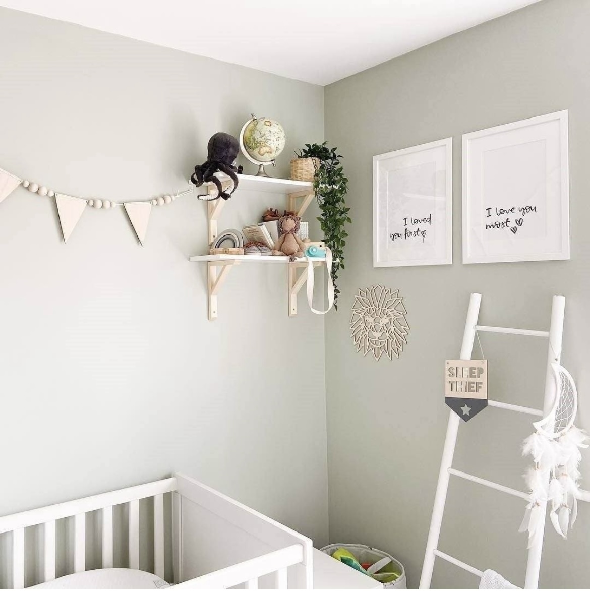
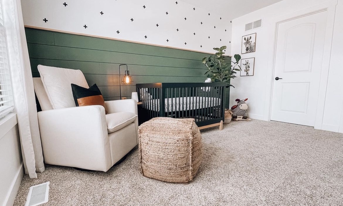
1.Feel Good Sage Green
Mizzle is one of Farrow and Ball’s most popular shades, and for good reason too! It’s hard not to feel good in a soft sage green and it’s unisex too which makes it the ideal shade for a nursery.
Nicole added, “sage green is one of the easiest colors on the eye. It’s soothing, serene, keeps us in touch with nature and is a perfect color for a nursery, no matter the orientation of the room”.
Paint color used: Mizzle Farrow and Ball
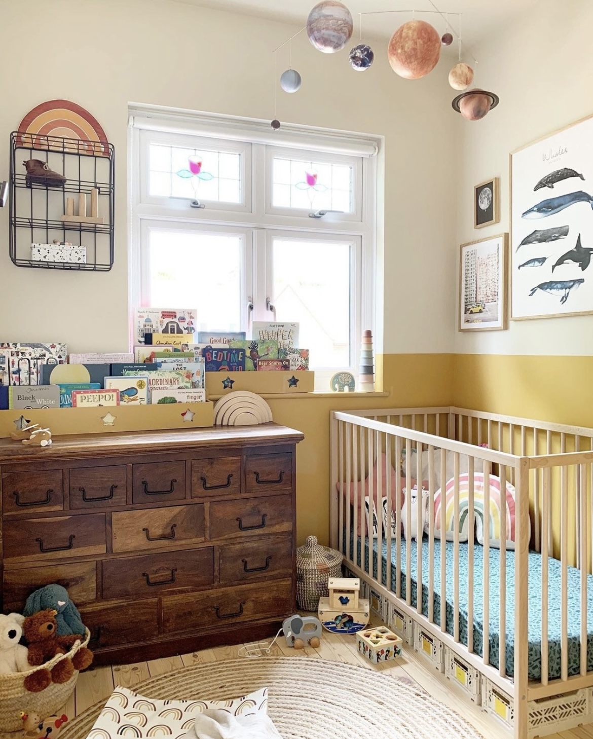
2. Buttery Yellow Tones
Another unisex color that feels good to be around is buttery yellow and heritage yellow tones, pair with a soft white on the ceiling to balance the intensity of yellow.
“We’re going to be seeing a lot more use of yellow in our interiors into 2025 with global paint brand Dulux announcing their color of the year, True Joy – a warm, joyful yellow. It can feel pretty intense used on all walls, but it looks great on half wall panelling or on as an accent color on woodwork to warm up a room” said Nicole.
Paint colors used: Shadow white and India yellow by Farrow and Ball
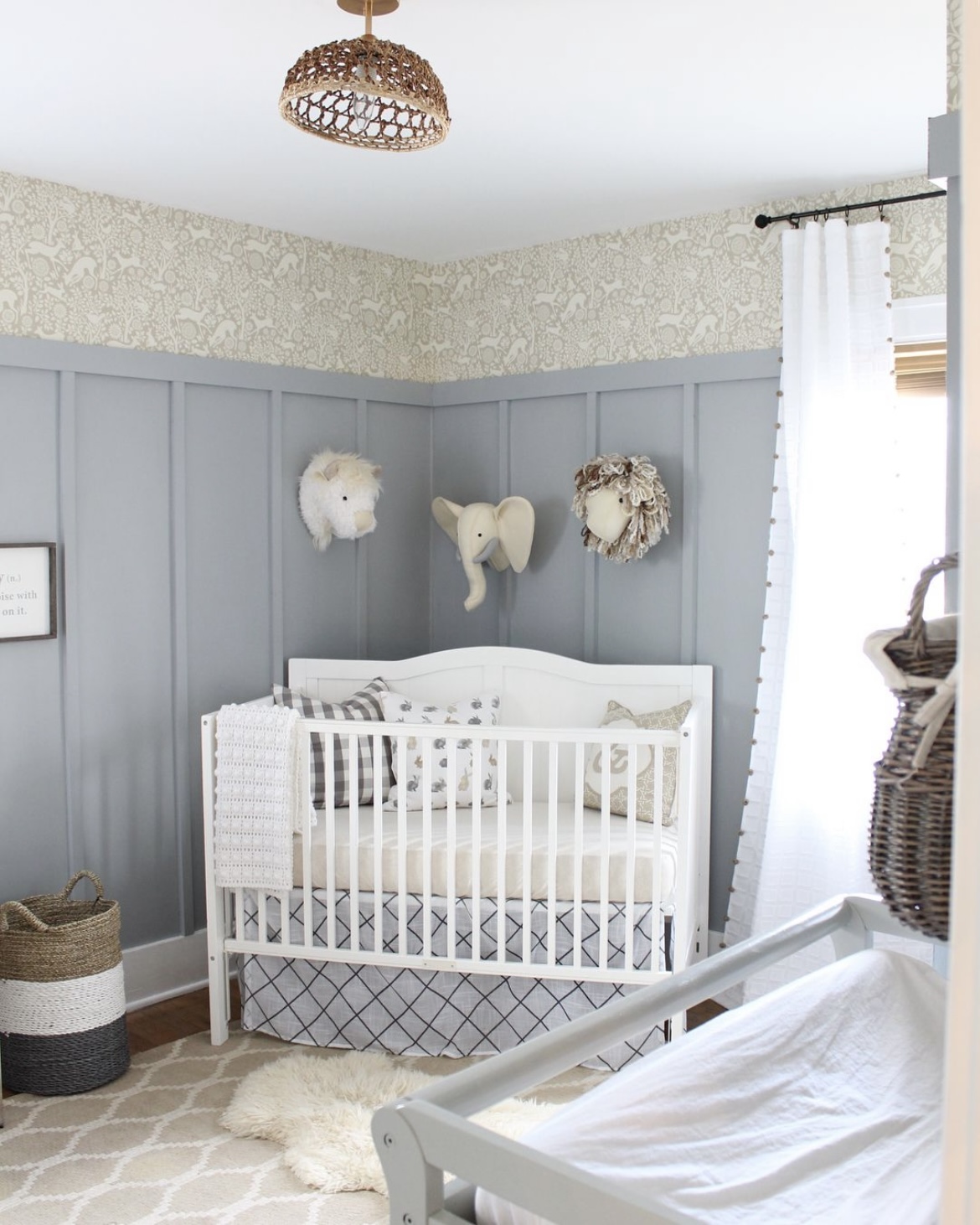
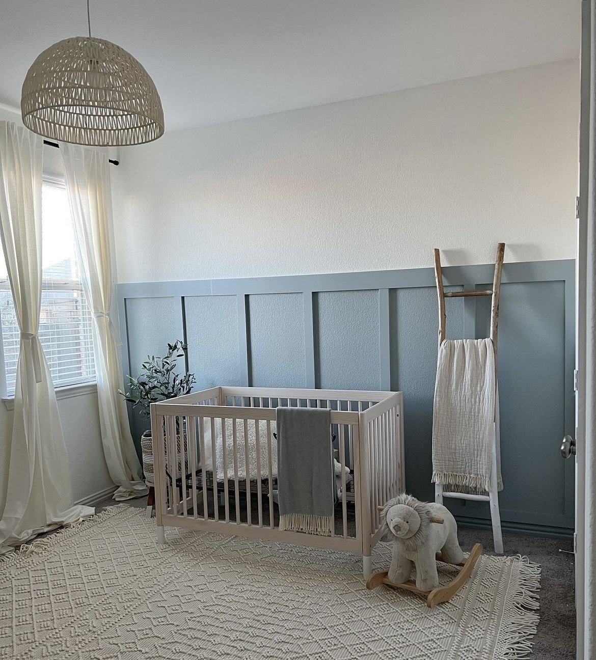
3. Blissful Blue
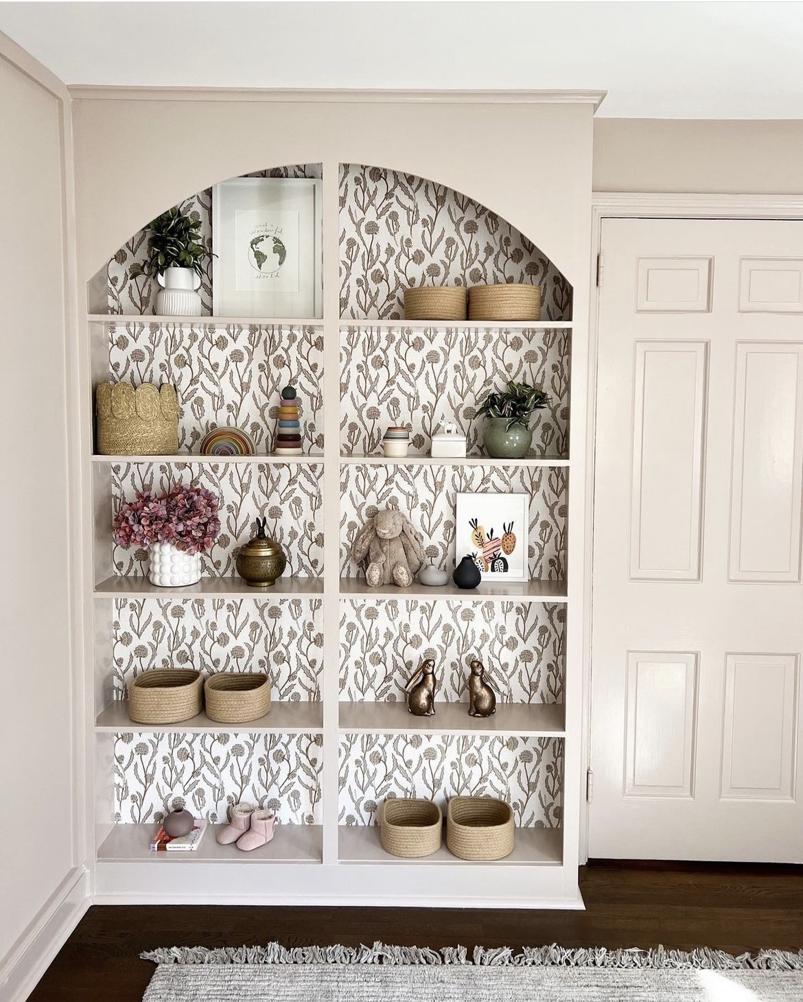
Soft, coastal blues are a popular color, no matter the gender in a nursery. This color grounds the room and is complemented by this charming wallpaper.
Wallpaper is always a good idea in a nursery, it can be updated as your little one grows and it brings such a cozy feeling to a nursery.
Paint used: Cool Metalwork Grey by Glidden, lightened by 50%
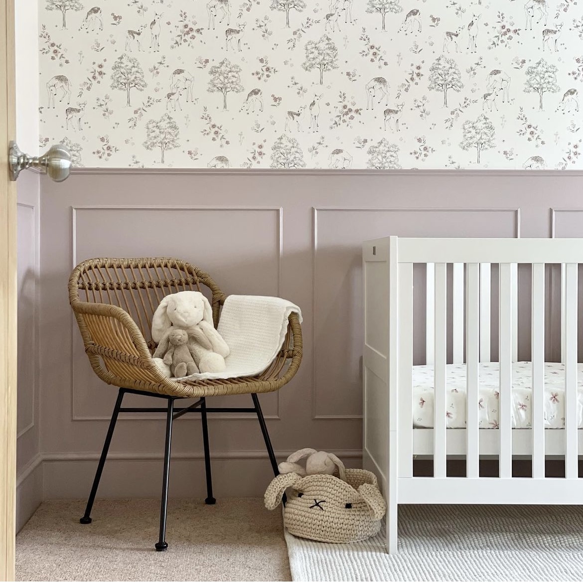
4. Soft Pink
If you’re painting a little girls nursery, pink may feel like an obvious choice. Rather than going for bold hues, stick to soft, blush pinks or those with a plaster look.
They add much more softness to a room scheme and are transitional pinks that will stand the test of time as baby grows.
Paint used: Rusling – The Little Greene Paint Company
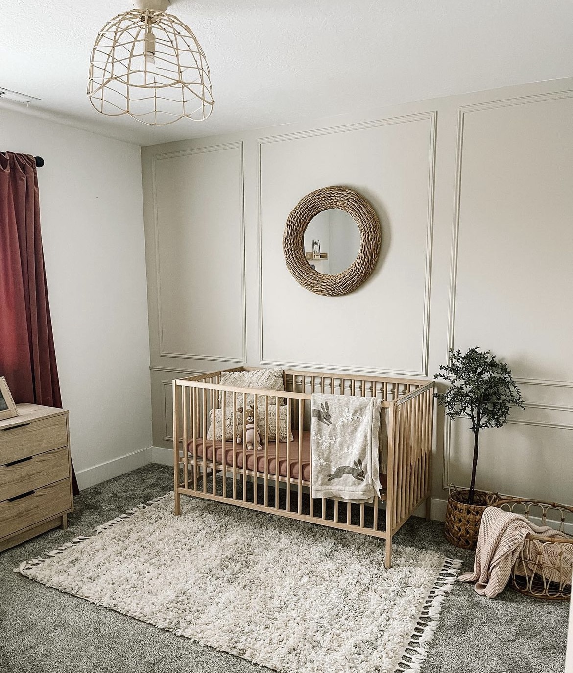
5. Sandy Beige Hues
Nicole shared with us that warm, rich neutrals continue to reign supreme in interiors, and they make a great starting point for a unisex nursery scheme.
“Accessible Beige has long been one of Sherwin Williams most popular neutrals and it creates the most gorgeous sandy base for a nursery. What I love about this shade is that it works in virtually any orientation of room. Plus, whether you want a coastal or boho inspired nursery, this multi purpose beige works with pretty much any interior style”.
Paint used: Accessible beige by Sherwin Williams
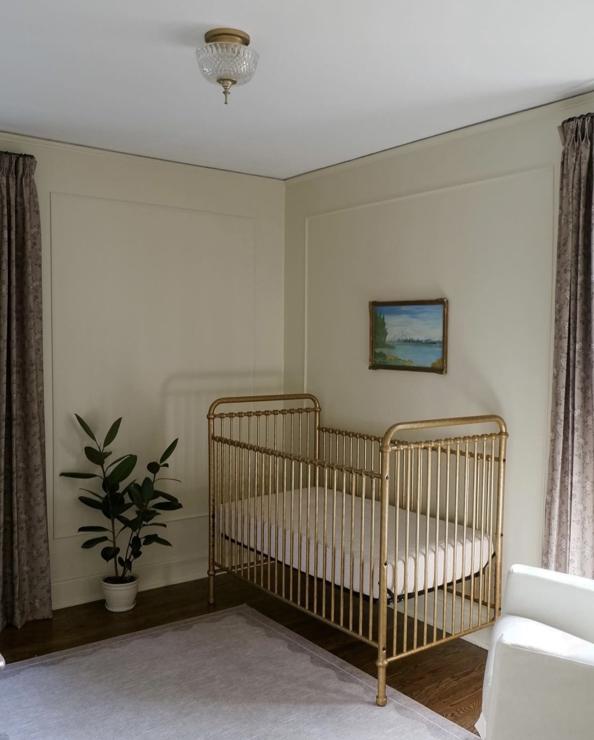
6. Cool off-white
There are virtually 100’s and 1000’s of different white shades which can make nailing down that perfect shade of white for a nursery that bit harder. Where to start?
Nicole said, “a lot of people overthink white in an interior, but there are some basic principles to follow which make choosing one so much easier. If you have a south facing nursery, you want to choose a white with cooler undertones, such as blue or white, this will balance the intensity of the sun, resulting in a much softer, subtle color on the walls. Cold north facing room? It needs warmth! Look for whites with red, pink or yellow based undertones, it will counteract any blue light associated in these rooms and make the space feel so much cozier”.
Paint used: Incredible White on the walls and Anew Gray on the crib by Sherwin Williams.
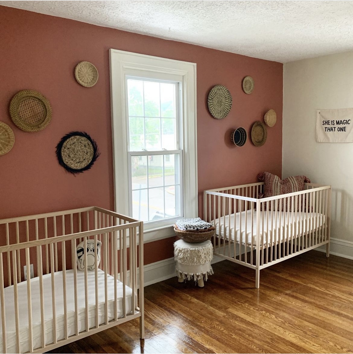
7. Red Accents
Earthy reds and terracottas make a gorgeous, bold addition to a nursery. Just remember to use it as an accent color only, on all walls and it will overpower the room, and how you feel within it.
Pair with soft whites and neutral details to balance the red in the nursery.
Paint used: Pajarito Red by Valspar.
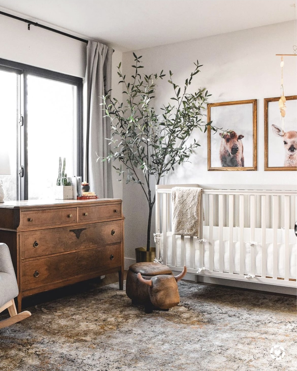
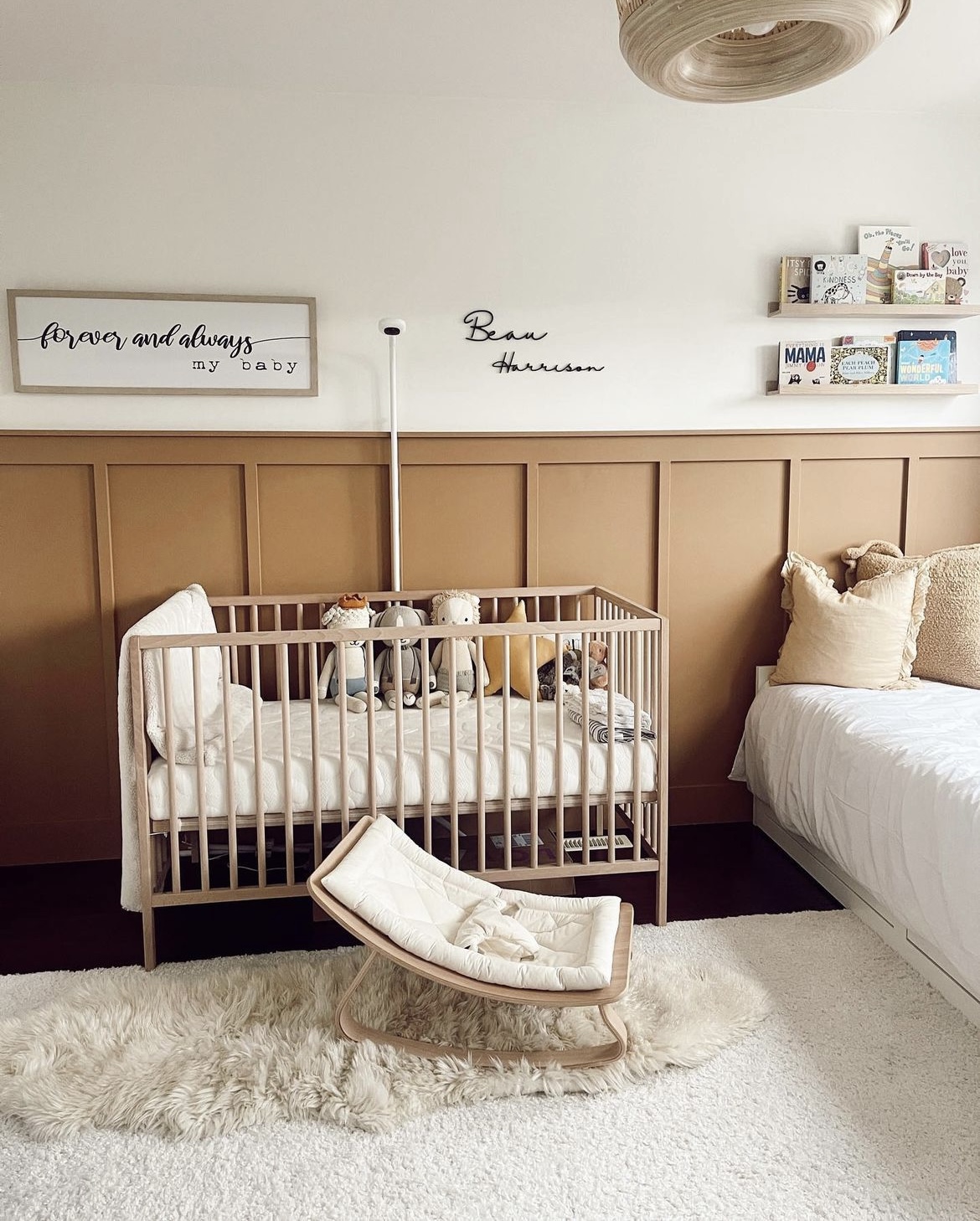
8. Cozy Browns
Richer, warmer neutrals have become ever popular over the last couple of years. Nicole shared that colors such as brown are the ‘new neutrals’ on the block. After years of grey washing our interiors, we need warmth, comfort and something that hugs us.
Desert Beach by Benjamin Moore looks gorgeous on this half wall panelling, it just gives the room the coziest hug and feels good to be in.
Paint used: Desert Beach by Benjamin Moore
9. Olive Green
If you want to lean into something dark, olive green is a great middle ground. You still get those benefits of using green in your interior, but it has a bit more depth and character than a traditional sage green.
Pair with a gorgeous soft white and black accents. The black will add definition to the nursery and pull the scheme together.
Paint used: Behr pinecone hill
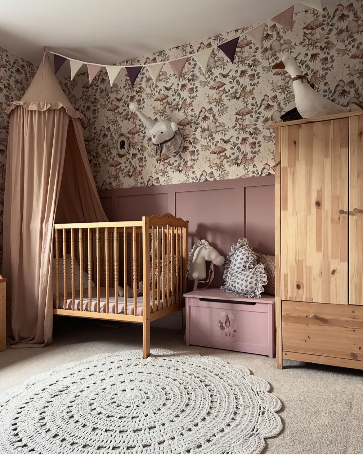
10. Sultry Rose Pink
Just in case you need some more pink inspiration from a nursery, take note from the below image!
“Sulking Room Pink is one of the colors that just feels good in any room. It’s sophisticated and pink, yet has a mature, moody quality to it. Paired with a charming wallpaper and you’ve got the most perfect little girls nursery that will see her through to kindergarten”.
Paint used: Sulking Room Pink by Farrow and Ball
11. The Perfect Soft Grey
Nicole shared with us about choosing the perfect white for your space, and Wevet is one of her fail safe whites for a sunny south facing nursery.
“Wevet has the softest hint of grey which makes a sunny south facing room feel a little bit cooler, without it feeling like a grey in the space. In this nursery it pairs beautifully with the ever popular color Calamine and brings such a beautiful softness through the space”.
Paint used: Wevet and Calamine by Farrow and Ball
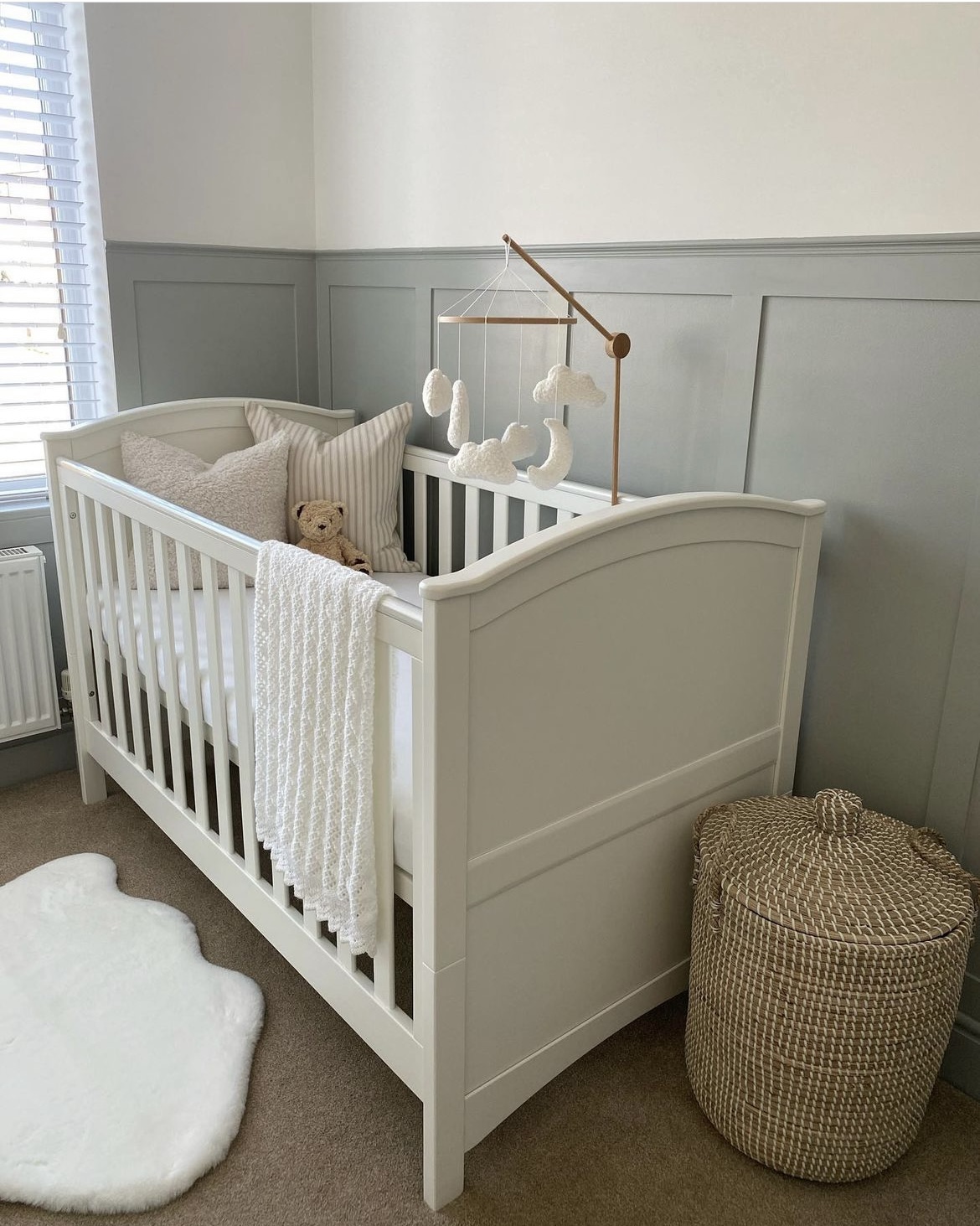
12. Gray, Blue Tones
Another super soft color for a nursery is a gray blue – it’s unisex, comforting and pairs beautifully with a neutral interior scheme.
How gorgeous does this nursery below look with the white crib and wooden mobile?
Paint used: Slaked Lime by The Little Greene Paint Company, Lamp Room Gray by Farrow and Ball
13. Coastal Inspired
Coastal inspired interiors have never not been on-trend, but blue can often get a rap for being a cool color in a space.
Nicole said, “Blue is one of the hottest rising colors that I have been seeing across interiors over the last year. Blue isn’t this cold color that should be avoided. In the right tone it can add warmth, but it’s also an incredibly soothing color to be around. I’d go as far as saying that a soft hue of blue will surpass the popularity we have seen of sage green in recent years”.
Paint used: Simply White by Benjamin Moore, Rainy Days by Magnolia on the accent wall panelling.
14. Plaster Pink
The color of plaster is one that you want bottled up sometimes as it just feels so warm and good on the walls. Well, it turns out that it actually does look great in paint form and it pairs beautifully with this wallpaper by Spoon Flower in the nursery below.
This soft pink is comforting, serene and the perfect shade for a unisex nursery.
Paint used: Benjamin Moore Meadow Pink.
15. The Perfect Greige
Forget beige, it’s all about the perfect green/beige and we have definitely found that with this Benjamin Moore shade below.
“A beige with a green undertone is perfect for a nursery as it balances light well in both north and south facing rooms. It also has a metamorphic quality to it, in some lights it looks like a khaki green, mushroom or beige, a paint shade that keeps you feeling interested no matter what angle you look at it in”.
Paint used: Carrington Beige by Benjamin Moore
Which of these paint shades are your fave for a nursery? A big thanks to Nicole for sharing her paint expertise with us!